A brighter preview is not always a better photograph. Start with the part of the image you want to improve, change one control at a time and keep an eye on areas that can lose useful detail.
- The tested example
- Step 1: Open Photo Adjustments with an untouched original
- Step 2: Load the photograph and inspect the neutral preview
- Step 3: Apply Gentle lift and read all three values
- Step 4: Export the edited PNG and review it separately
- Check the result
- Troubleshooting
- Background and practical details
- Example sources
TESTED WORKED EXAMPLE
What this session produced
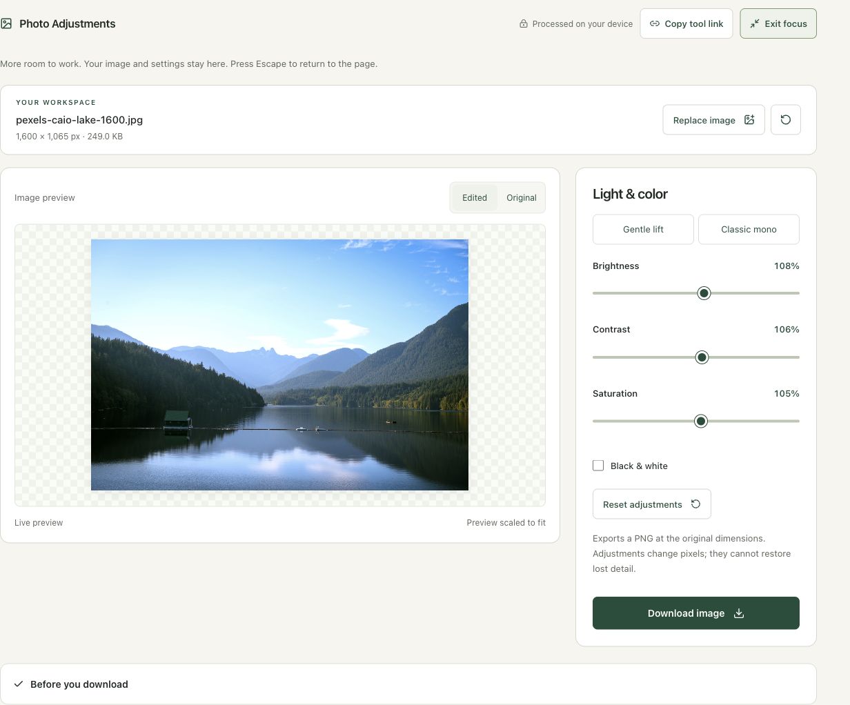
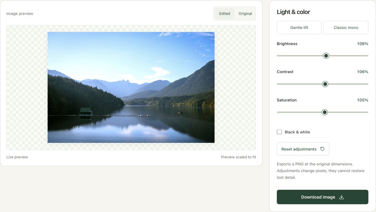
The Gentle lift preset applied brightness 108%, contrast 106% and saturation 105% to the 1,600 × 1,065 lake photo. The editor exported a PNG at the original dimensions.
The screenshots were captured from our working tools on October 6, 2026. Focus workspace is used to give the controls and preview more room. Captures show either the full workspace or the relevant panel; they are not recreated interface illustrations. Sizes and outcomes describe this sample, not a promised result for every image.
Follow the worked example, step by step
Read the settings and the result together. Keep an untouched source when a file is edited, and check the finished output before using it in another application. Each numbered step below includes a real screenshot of the corresponding workspace state. Use the full-size link when a control label is too small on your screen.
Step 1: Open Photo Adjustments with an untouched original
Open Photo Adjustments to change light and color while keeping the image dimensions. Work from the clearest original available. Repeatedly editing a compressed sharing copy can make artifacts harder to distinguish from the adjustment itself. Choose a specific aim, such as lifting dark areas slightly, before moving several sliders at once.
Step 2: Load the photograph and inspect the neutral preview
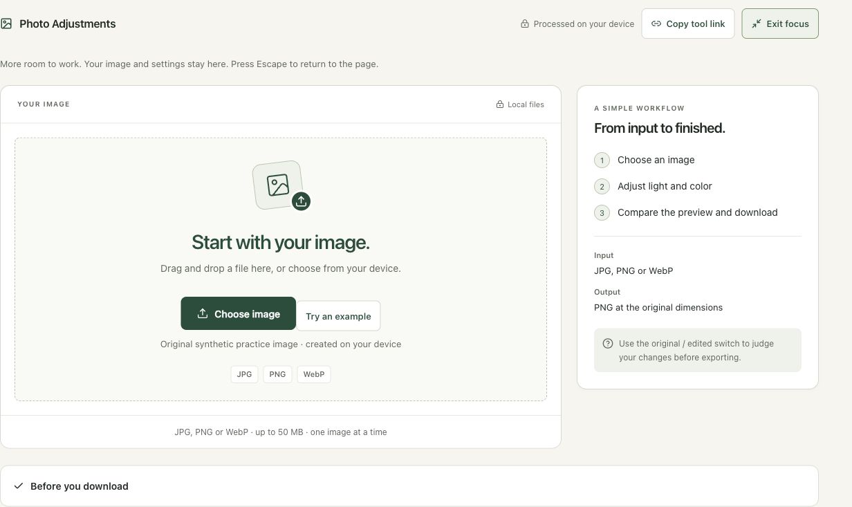
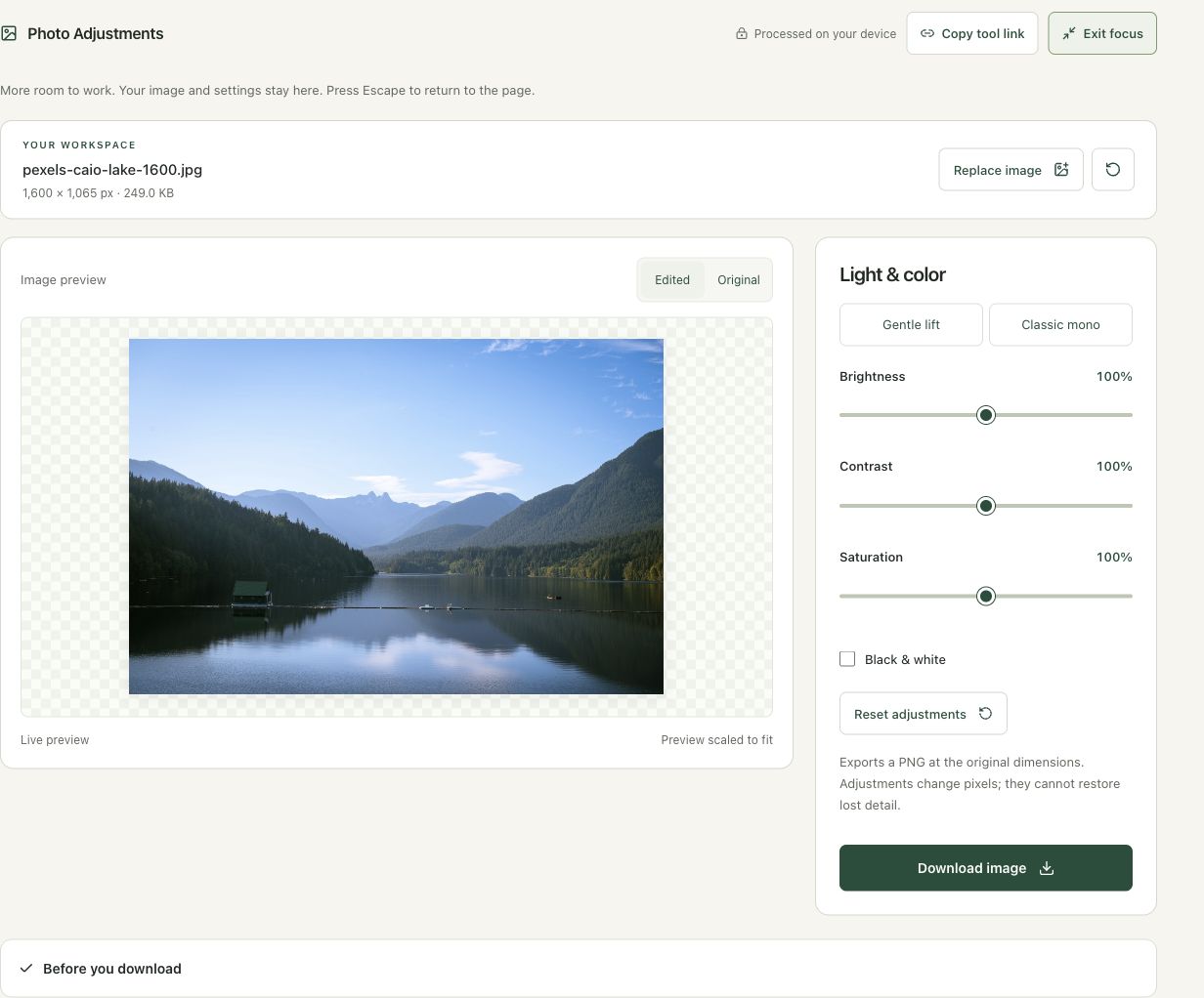
Choose the lake JPG and read its 1,600 × 1,065 dimensions. The neutral controls begin at 100% brightness, contrast and saturation. Compare the sky, mountains and shaded foliage before applying a preset. A baseline view helps you notice whether the finished edit is useful rather than simply more vivid.
Step 3: Apply Gentle lift and read all three values
Choose Gentle lift. The preset sets brightness to 108%, contrast to 106% and saturation to 105%. These are starting values for this example, not universal recommendations. Switch to Original to judge the change, then return to Edited. If the sky loses subtle tones or leaves look unnatural, reduce the corresponding adjustment rather than adding another strong preset.
Step 4: Export the edited PNG and review it separately
Choose Download image and wait for the ready status. This workflow produces a PNG at 1,600 × 1,065. Open the downloaded copy outside the editor and compare it with the source at a similar display size. Keep the original JPG. If you need a smaller web delivery file, convert a copy afterward and inspect the combined effect of editing and encoding.
Check the result before using it
Check shadows, bright sky and saturated greens at the intended display size. Compare Original with Edited. A brighter fitted preview can conceal clipped highlights or exaggerated color; inspect the downloaded PNG before replacing a delivery image.
If the result is not what you expected
Adjustments change existing pixels and cannot restore missing detail. Reset to neutral values or start from the original when several changes interact poorly. PNG can be much larger than the original JPG; choose a separate delivery conversion after the edit is approved.
Background and practical details
Identify the problem before using a slider
Decide whether the picture is too dark, visually flat or excessively colorful. Those are different problems. Raising every control can produce a dramatic preview while damaging a useful image. Choose one concrete area to improve, such as a shaded subject, and compare it with the original as you work.
Use the highest-quality original available. A small sharing copy may already have lost detail in shadows or highlights. Editing that copy cannot recover information absent from its decoded pixels. Keep it as a reference and save any adjustment as a separate version rather than replacing the only source.
A value of 100 is the neutral setting for these controls. The numbers are adjustment parameters, not measurements of exposure stops, camera sensor detail or image quality. A setting of 120 does not mean the picture has gained 20% more information.
Inspect bright and dark regions
When increasing brightness, check pale clothing, clouds and reflections as well as the subject you wanted to lighten. When increasing contrast, check whether near-white and near-black regions lose separation. A pleasing middle area can distract you from damage elsewhere in the frame.
If a region becomes a flat bright or dark patch, reduce the change and compare again. Starting from a less aggressive setting is often easier than trying to repair an overprocessed export. The workspace applies pixel adjustments; it does not recover the richer camera information of a separate RAW-development workflow.
Use saturation with a specific goal
Increasing saturation can make color differences stronger, but it can also make skin, painted surfaces or product colors look implausible. Reduce it when a restrained result is more useful. Check neutral areas too: a unwanted tint can become more conspicuous even when you mainly notice the colorful subject.
Black-and-white output removes the color distinction, so objects that were separated by hue may become similar in tone. Check whether the message still reads clearly. A grayscale version is a composition choice, not proof that the original colors were incorrect.
Separate edits from export format
The download is a PNG at the original pixel dimensions. A larger PNG does not mean the adjustment created more real detail, and a lossless encoding does not make the deliberate pixel edits reversible. Keep the source if you want to try another brightness or color treatment later.
The browser stores and edits decoded pixel data, whose channel representation is described in MDN’s ImageData reference. This workflow preserves the working dimensions but changes the channel values. It is not a color-profile certification or a guarantee of an exact match across uncalibrated screens.
Review where the picture will be used
Open the downloaded image in the destination application and compare it with the source. Inspect text, faces and smooth gradients. If you only want stronger edge definition, try Sharpen Image separately. If the delivery copy needs fewer bytes, choose an optimization workflow after deciding which adjusted version is worth keeping.
Keep an untouched source and inspect the downloaded result. If an instruction differs from the workspace, send the page URL and the setting involved. Our editorial policy explains how we review examples and limitations.
Example sources and screenshot notes
The example uses a resized 1,600 × 1,065 copy of Lake surrounded by green mountains by Caio.
These photographs are used under the Pexels license. They are licensed images, not claimed as public domain. The photographer links identify the original sources; resizing and example processing were performed for this tutorial.
The controls shown are from the version tested for this guide. A later interface update or a different source can change a result. Compare the displayed format, dimensions and status with the instructions, and report a mismatch with the article URL and the setting involved. Our editorial policy explains how examples and corrections are reviewed.
Find the right tool for your image.
Explore the free workspaces, read their methods and inspect your result before sharing.
Explore image tools