An image can suggest useful colors, but a sampled palette and an exact pixel answer different questions. Choose the kind of result you need, then test the color in its real design context.
- The tested example
- Step 1: Open Color Picker and decide between a pixel and a palette
- Step 2: Load the flower photo and inspect its grouped palette
- Step 3: Sample pixel X 450, Y 600 and review its values
- Step 4: Export JSON and keep the palette’s limits documented
- Check the result
- Troubleshooting
- Background and practical details
- Example sources
TESTED WORKED EXAMPLE
What this session produced
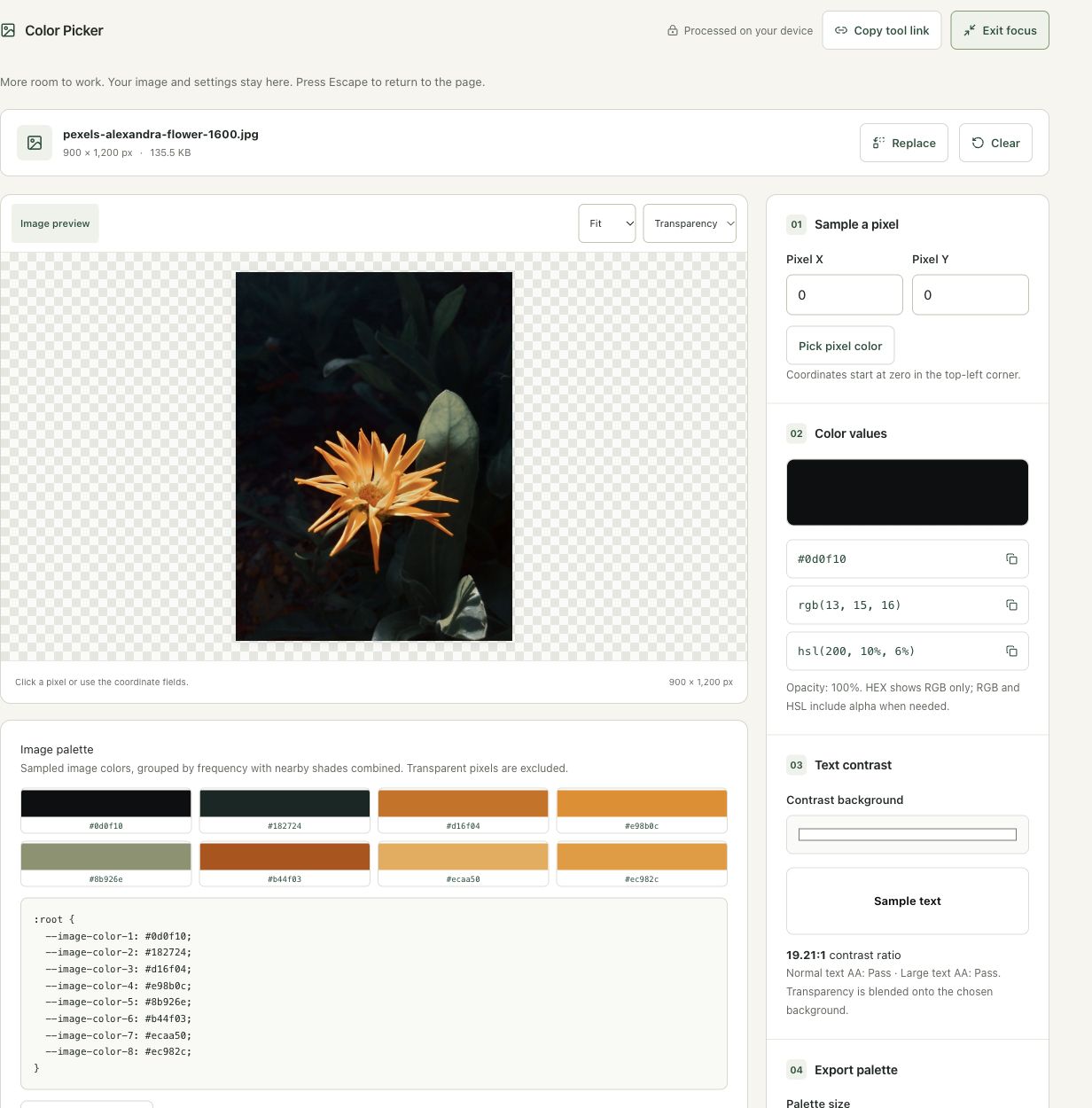
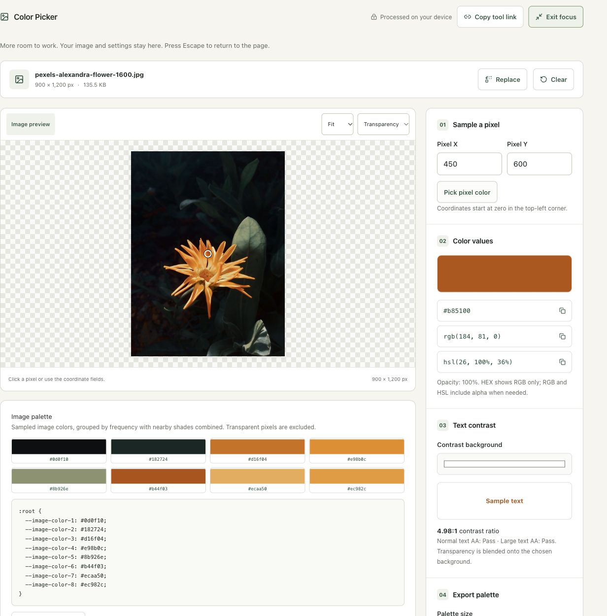
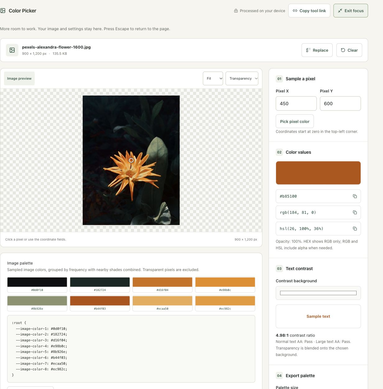
The 900 × 1,200 flower photo was sampled at pixel (450, 600). The workspace provided that pixel’s color representations and a separate frequency-grouped palette, which was exported as JSON.
The screenshots were captured from our working tools on October 6, 2026. Focus workspace is used to give the controls and preview more room. Captures show either the full workspace or the relevant panel; they are not recreated interface illustrations. Sizes and outcomes describe this sample, not a promised result for every image.
Follow the worked example, step by step
Read the settings and the result together. Keep an untouched source when a file is edited, and check the finished output before using it in another application. Each numbered step below includes a real screenshot of the corresponding workspace state. Use the full-size link when a control label is too small on your screen.
Step 1: Open Color Picker and decide between a pixel and a palette
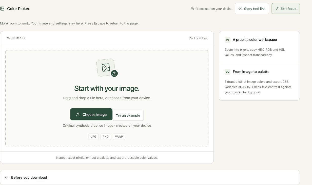
Open Color Picker. Use an exact sample when matching a particular part of an image, and a palette when exploring a design direction. Neither method establishes official brand values from a compressed photograph. Keep the best source available and consider the background on which a recovered color will be used.
Step 2: Load the flower photo and inspect its grouped palette
Choose the portrait flower. The workspace displays 900 × 1,200 pixels and a palette of sampled color groups. Large dark areas can dominate the palette even when the bright petals attract attention. Read the explanation about grouped frequency before assuming the first swatch is the ideal primary color for a design.
Step 3: Sample pixel X 450, Y 600 and review its values
Enter 450 in Pixel X and 600 in Pixel Y, then choose Pick pixel color. Review HEX, RGB, HSL and opacity. These coordinates select the middle region of this source; use different coordinates for another image. Check text contrast against the actual intended background rather than interpreting a vivid photo color as automatically suitable for a button label.
Step 4: Export JSON and keep the palette’s limits documented
Choose JSON color values in Palette format, then Download palette. Use the file as a starting point and assign color roles deliberately in your design. Check normal text, large text, focus and other interface states separately. Changing the number of palette groups changes the approximation; it does not alter the photo or produce a certified inventory of its colors.
Check the result before using it
Read opacity and the selected contrast background along with HEX, RGB and HSL. A sampled photo color is not automatically an official brand color. The grouped palette is an approximate design aid rather than a list of every exact pixel.
If the result is not what you expected
Coordinates start at zero, so this image ends at X 899 and Y 1,199. A pixel sample and a palette swatch can differ. Passing the displayed solid-background text checks does not certify an entire page, especially when text is placed over changing photographic detail.
Background and practical details
Decide whether you need a pixel or a palette
For matching a particular part of a graphic, sample the intended pixel. For exploring a design direction, start with the extracted palette. A small area of a logo may not become one of the most frequent sampled colors, and a palette color may combine nearby shades rather than equal the pixel under a specific point.
Open Color Picker with the original JPG, PNG or WebP. A compressed screenshot of a logo can contain slightly altered edges and colors. When precise brand values matter, use the approved source asset or style guide rather than treating a recovered screenshot color as authoritative.
Coordinates start at zero in the top-left corner. A 640 × 480 image has valid X coordinates from 0 through 639 and Y coordinates from 0 through 479. Enter whole numbers inside those bounds. Sampling an antialiased edge can produce a partly transparent color; sampling the center of a flat shape may give a different result.
Interpret transparency
HEX displays the RGB channels in this workspace, while RGB and HSL representations include alpha when needed. A transparent color can look different over white and dark surfaces even when its stored RGB channels are unchanged. Read opacity instead of assuming a pale preview means the image stores an opaque pale color.
The contrast preview blends a partially transparent selected color onto the chosen Contrast background. That is useful for a planned text color, but the same color used over a photograph can have a different background at every point. Inspect the final composition rather than relying on one solid-color preview for all placements.
Use a palette as a starting point
The palette comes from a reduced image sample, with nearby shades grouped by frequency and transparent pixels excluded. Choose up to 6, 8 or 12 distinct colors. It is not an exhaustive inventory of every source pixel or a certified dominant-color analysis. A small accent can be missed or combined with a nearby shade.
Copy CSS variables or export CSS or JSON for a reusable working palette. Name the colors by their design role in your own project after choosing them. Frequency in a photograph does not tell you which color should become a button, a background or a text color.
Check text readability separately
The W3C contrast guidance describes AA thresholds of 4.5:1 for ordinary text and 3:1 for qualifying large text. The tool displays both checks for the selected solid background. Passing that pair of colors does not certify the entire interface.
Font size, weight, background variation and the actual rendered state still matter. Test hover, disabled and focus states separately when building an interface. Do not choose a color solely because it appears attractive in the palette. A useful design system balances the image’s inspiration with readable labels and consistent interaction cues.
Keep an untouched source and inspect the downloaded result. If an instruction differs from the workspace, send the page URL and the setting involved. Our editorial policy explains how we review examples and limitations.
Example sources and screenshot notes
The example uses a resized 900 × 1,200 copy of Close-up shot of orange flower by Alexandra Diniz.
These photographs are used under the Pexels license. They are licensed images, not claimed as public domain. The photographer links identify the original sources; resizing and example processing were performed for this tutorial.
The controls shown are from the version tested for this guide. A later interface update or a different source can change a result. Compare the displayed format, dimensions and status with the instructions, and report a mismatch with the article URL and the setting involved. Our editorial policy explains how examples and corrections are reviewed.
Find the right tool for your image.
Explore the free workspaces, read their methods and inspect your result before sharing.
Explore image tools