A caption works when the reader can understand both the words and the picture. Automatic wrapping helps fit the text, but editing the wording and checking the final display size are still essential.
- The tested example
- Step 1: Open the caption workspace with readable wording
- Step 2: Load the photo and write two short captions
- Step 3: Use Arial, mixed case and an intentional line break
- Step 4: Choose the export format and inspect the raster text
- Check the result
- Troubleshooting
- Background and practical details
- Example sources
TESTED WORKED EXAMPLE
What this session produced
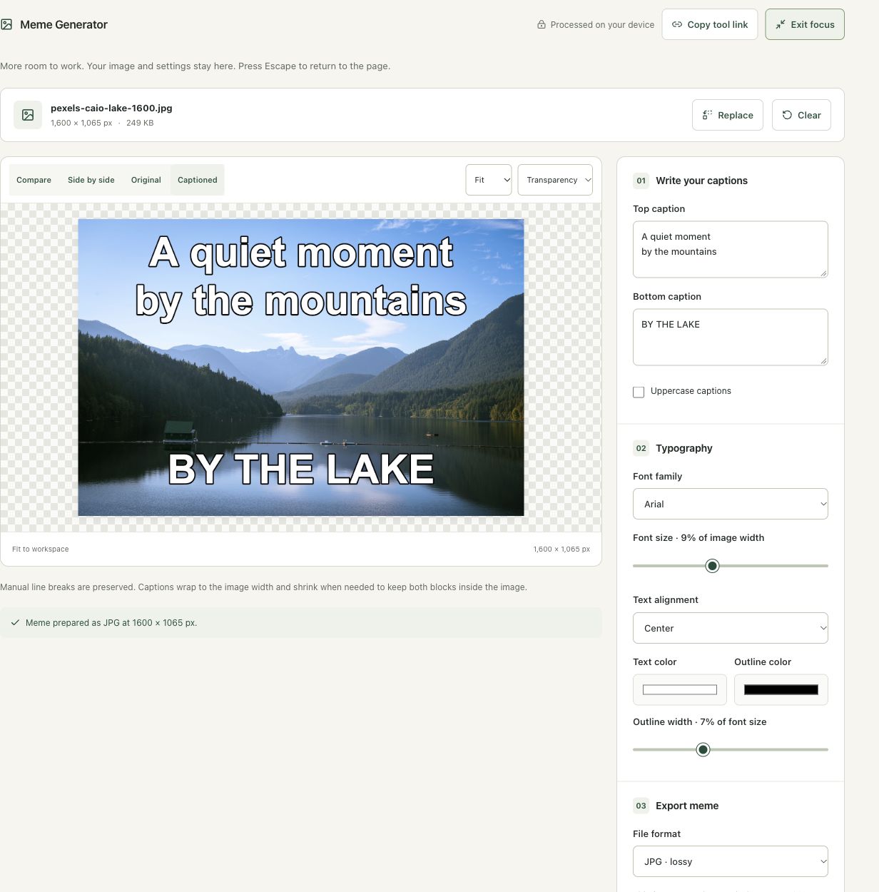
The lake photo received top and bottom captions. The final example used Arial, a manual line break in the top caption, mixed case and JPG at 92%, while retaining 1,600 × 1,065 pixels.
The screenshots were captured from our working tools on October 6, 2026. Focus workspace is used to give the controls and preview more room. Captures show either the full workspace or the relevant panel; they are not recreated interface illustrations. Sizes and outcomes describe this sample, not a promised result for every image.
Follow the worked example, step by step
Read the settings and the result together. Keep an untouched source when a file is edited, and check the finished output before using it in another application. Each numbered step below includes a real screenshot of the corresponding workspace state. Use the full-size link when a control label is too small on your screen.
Step 1: Open the caption workspace with readable wording
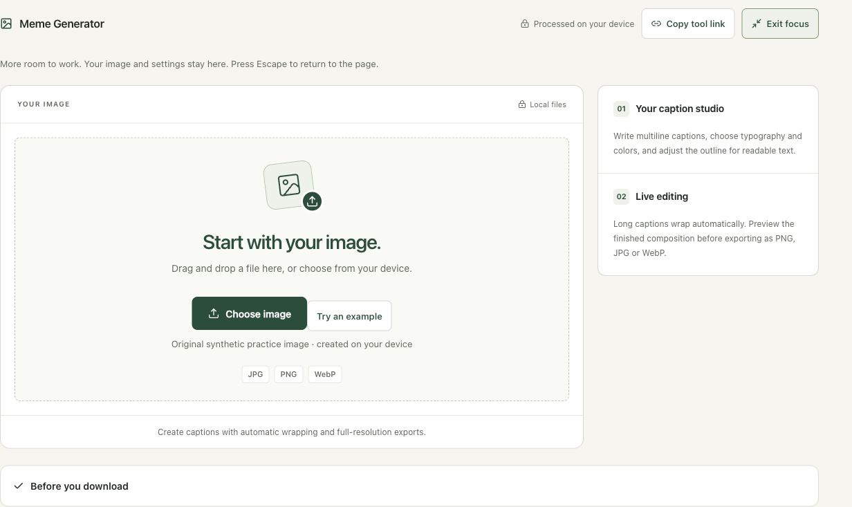
Open Meme Generator to add top and bottom caption blocks. Plan concise wording and choose a permitted photograph. This example describes a landscape rather than attributing a quote to a person. The editor wraps captions and supports manual line breaks, but a crowded composition can still become difficult to read at the final display size.
Step 2: Load the photo and write two short captions
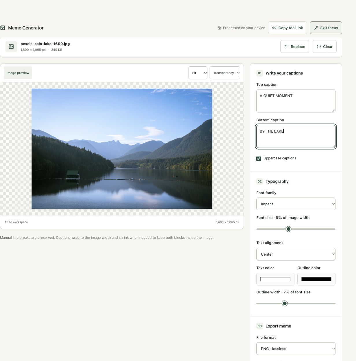
Choose the lake image. Replace the placeholders with A QUIET MOMENT at the top and BY THE LAKE at the bottom. Inspect which parts of the photograph the text covers. The initial white text and dark outline improve separation from varied backgrounds, but they do not establish readability in every location or at every size.
Step 3: Use Arial, mixed case and an intentional line break
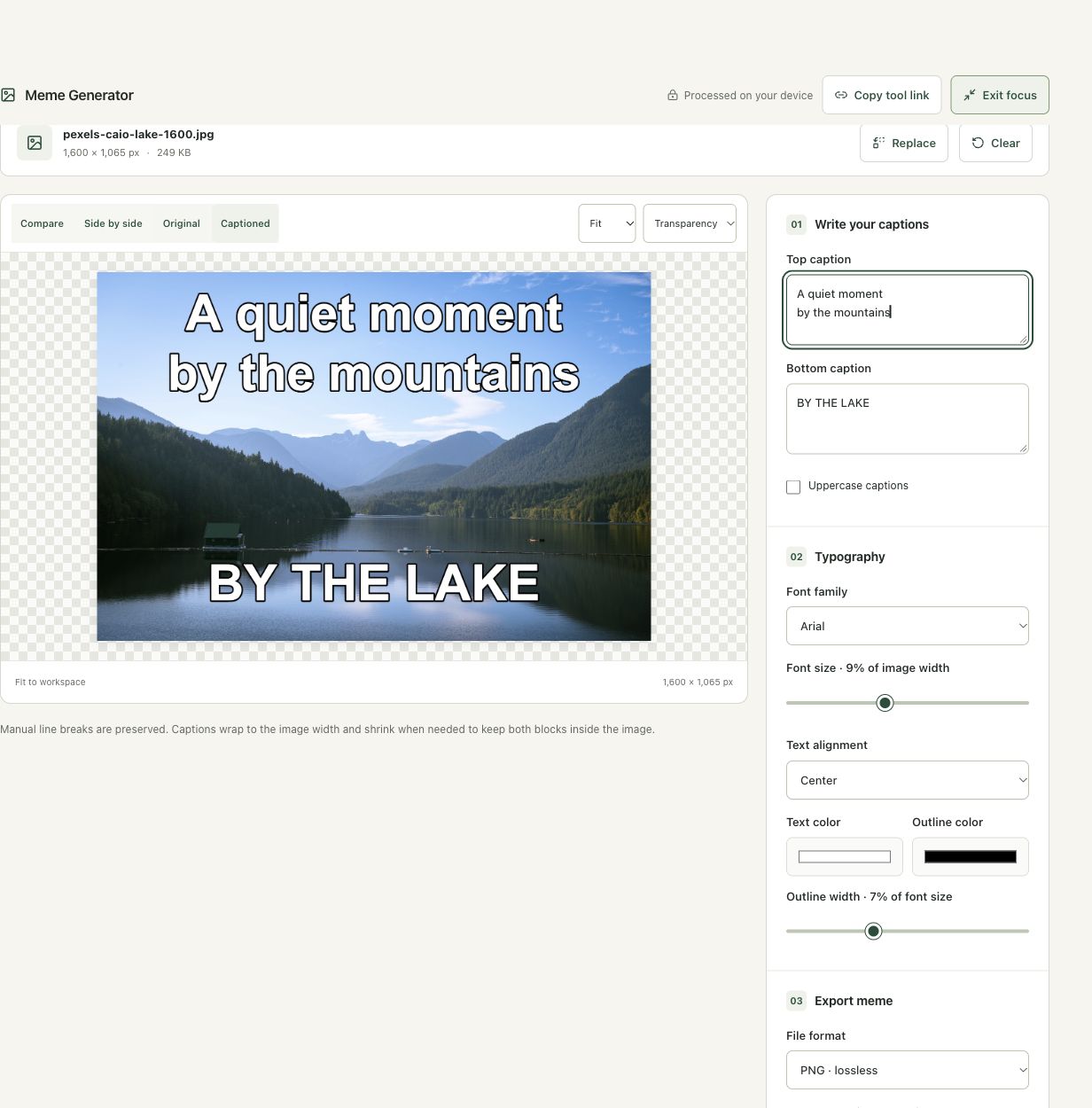
Choose Arial, turn off Uppercase captions, and enter A quiet moment followed by a line break and by the mountains in the top block. Keep the bottom caption concise. Review both blocks together for balance and collisions with the scene. A line break is a composition choice, not a way to make unlimited text fit without reducing size.
Step 4: Choose the export format and inspect the raster text
Select JPG at the displayed 92% quality and choose Download meme. The output stays 1,600 × 1,065. Check the downloaded letters, outlines and wrapping. Choose PNG instead when retaining the edited pixels or alpha is more important than photographic file size. Keep the source and wording separately because the final image does not contain an editable text layer.
Check the result before using it
Check line wrapping, outlines and the smallest intended display size. The fitted preview can make text seem readable when the final post thumbnail is much smaller. The export is a raster composition without editable text layers.
If the result is not what you expected
Long captions shrink to stay inside the image. Shorten wording before trying a very small font. Fonts depend on device availability. JPG fills transparency with white and can introduce edge artifacts around letters; PNG is an alternative when exact edited pixels matter.
Background and practical details
Write around the picture
Start with the message, then choose an image you own or are permitted to use. Keep the opening and closing captions concise. If a sentence needs several lines to explain the scene, consider whether the picture is doing enough of the work or whether the wording can be shortened.
A readable graphic is useful for a tutorial, a friendly joke or an announcement. Do not let a caption imply that somebody said or endorsed something merely because their picture is visible. Keep the meaning clear in the shared context and preserve a clean original image for future versions.
Manual line breaks are retained, and long captions wrap to the image width. The renderer can reduce the text size to keep both caption blocks inside the image. That prevents some overflow, but it cannot guarantee that an overly long paragraph remains readable at a small display size.
Judge text at the viewing size
At a 9% setting on a 1,000-pixel-wide image, the initial font size is 90 pixels. If the whole image is later displayed at 250 pixels wide, that text scales to roughly 22.5 pixels before any additional fitting. A large source-resolution label can therefore become quite small in a feed or message preview.
Check the longest caption at the intended width. Shorten the wording if automatic fitting makes the letters tiny. Keep line breaks around natural phrases, not just where one word happens to fit. Review punctuation and spelling after toggling uppercase, since the visual emphasis can change.
Use outlines carefully
An outline helps separate text from a changing photograph. A very thick outline can fill counters inside small letters or overwhelm thin strokes. Start with a moderate outline and inspect both bright and dark parts of the image. Choose text and outline colors together rather than treating either value as sufficient by itself.
The selected fonts use the fonts available to the browser. Impact, Arial, Georgia and monospace provide different starting styles, but devices can substitute fonts. Inspect the rendered result on the device making the export. The downloaded image contains the resulting pixels, so it no longer depends on the recipient loading that font.
Choose the delivery format
PNG is a useful first export for sharp text and a graphic with transparency. JPG and WebP exports offer quality controls and can introduce encoding changes around letters. Compare a downloaded copy at a useful zoom when small text or thin outlines matter. Work from the original when making another variant.
MDN documents browser text drawing; wrapping and fitting here are supplied by this workspace. A raster caption is not selectable text. Include the essential message in the surrounding post or an appropriate text alternative when readers need access to the wording.
For a small identification label instead of caption blocks, use Add Watermark. For a specific canvas shape before writing captions, use Social Image Formatter and review its crop first.
Keep an untouched source and inspect the downloaded result. If an instruction differs from the workspace, send the page URL and the setting involved. Our editorial policy explains how we review examples and limitations.
Example sources and screenshot notes
The example uses a resized 1,600 × 1,065 copy of Lake surrounded by green mountains by Caio.
These photographs are used under the Pexels license. They are licensed images, not claimed as public domain. The photographer links identify the original sources; resizing and example processing were performed for this tutorial.
The controls shown are from the version tested for this guide. A later interface update or a different source can change a result. Compare the displayed format, dimensions and status with the instructions, and report a mismatch with the article URL and the setting involved. Our editorial policy explains how examples and corrections are reviewed.
Find the right tool for your image.
Explore the free workspaces, read their methods and inspect your result before sharing.
Explore image tools