Responsive images let the browser choose a suitable file for the space available on a page and the screen pixel density. A useful package includes measured widths, compatible fallback files and markup that matches the actual layout.
What this workflow solves
Responsive images let the browser choose a suitable file for the space available on a page and the screen pixel density. A useful package includes measured widths, compatible fallback files and markup that matches the actual layout. The following example uses the on-device synthetic practice image. Numerical dimensions describe the specified geometry, not a universal quality or compression result.
1. Start with a source that has enough detail
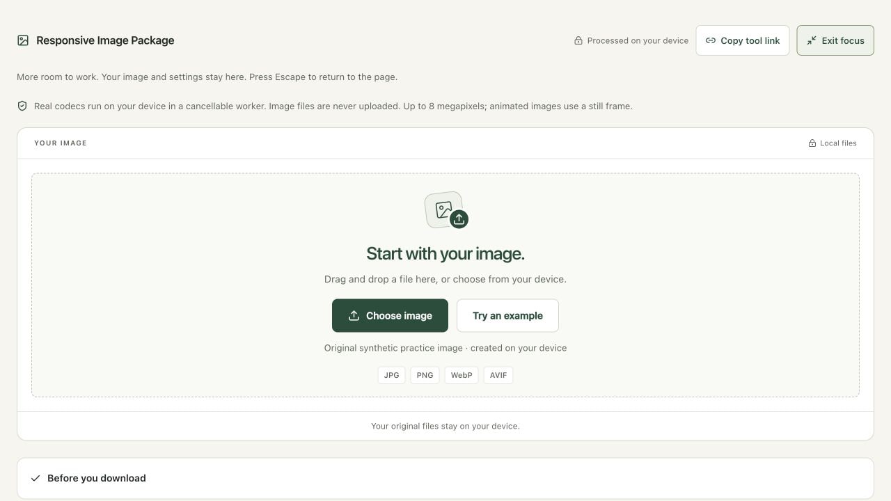
Open Responsive Image Package and choose a JPG, PNG, WebP or AVIF. Up to eight megapixels and 8192 pixels per side are supported; JPG, PNG and WebP files can be up to 50 MB and AVIF inputs up to 20 MB. Try an example produces an original synthetic 640 × 480 practice graphic. It is suitable for learning the controls, not measuring typical photographic savings. Larger source files need resizing before this particular workflow.
Write down the CSS width of the image in your layout. A 640-pixel source can provide 320-pixel and 640-pixel variants, but it cannot supply genuine extra detail for a 1280-pixel variant. This tool omits requested widths above the source and never enlarges it. Animated inputs use a decoded still frame. For artwork where animation is essential, preserve the original animated asset and use a workflow that explicitly supports that format.
2. Plan widths and compatible formats
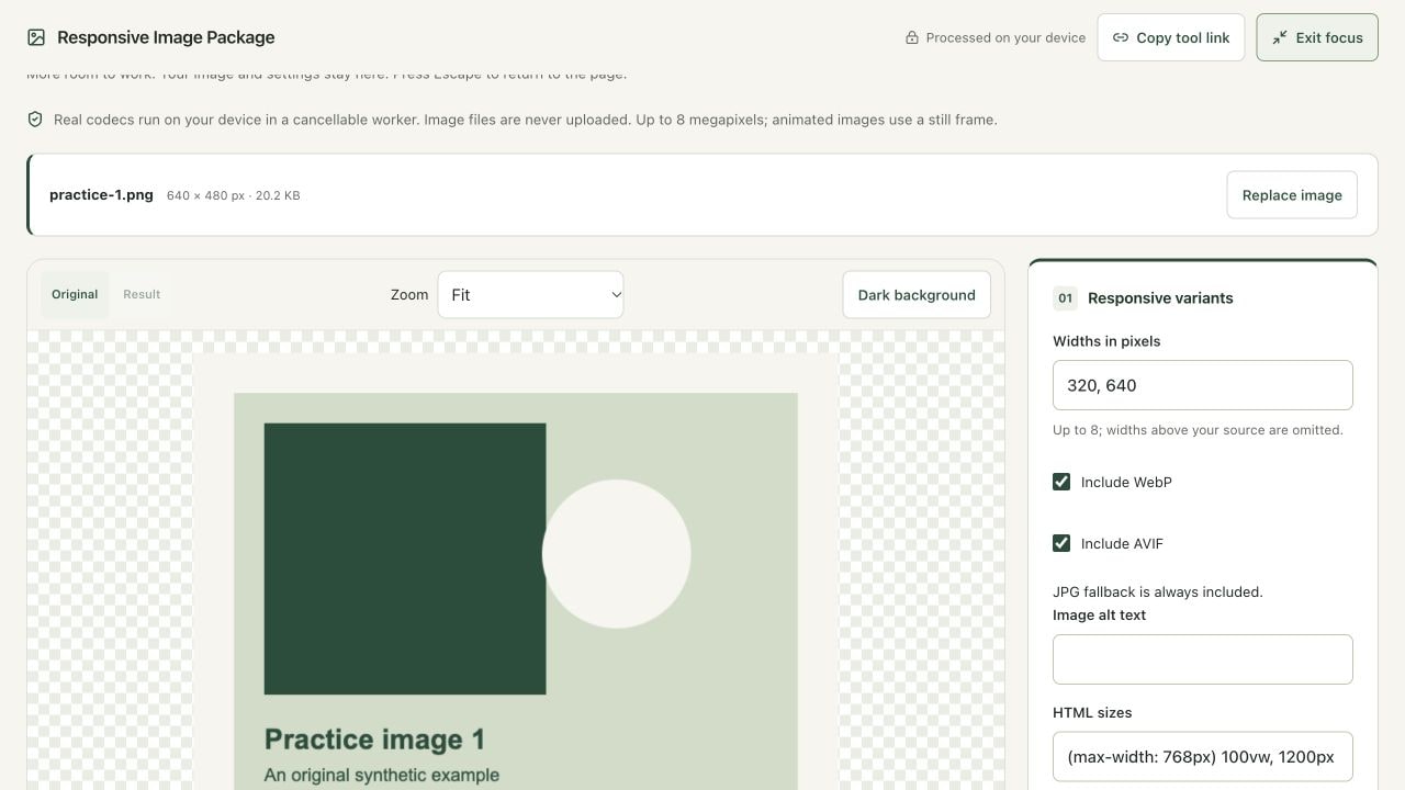
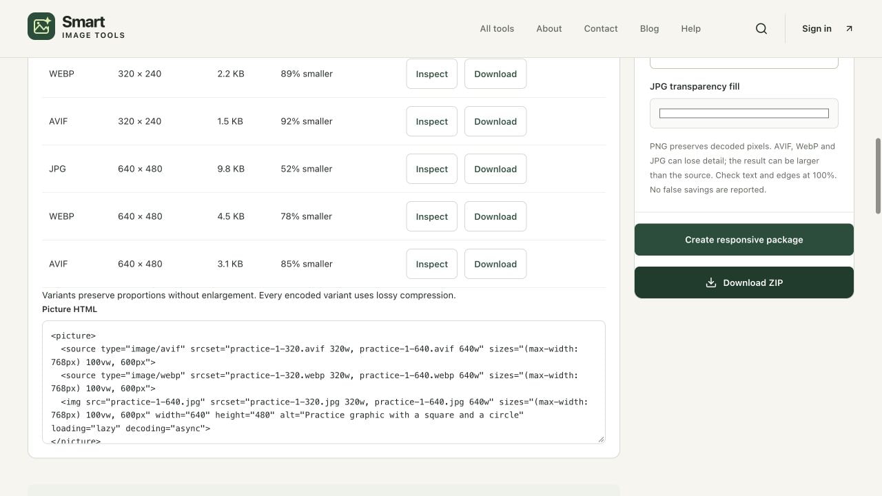
For the 640 × 480 example, enter 320, 640 in Widths in pixels. The resulting proportional heights are 240 and 480. Widths must be whole numbers from 16 to 8192, with at most eight requested widths. Duplicates are removed and widths are sorted. A width above the source is omitted; if every requested width exceeds it, the tool asks you to choose at least one usable width. Total width variants are limited to 24 megapixels to keep allocations bounded.
JPG fallback is always included. Keep Include WebP and Include AVIF checked when you want both modern alternatives. AVIF is encoded with a real local codec in a worker. Each width starts from the same source rather than from a previously reduced variant. The chosen quality setting applies to lossy encoding, but equal settings across codecs are not equivalent quality scores. Compare actual visual results instead of assuming that quality 75 has the same meaning in JPG, WebP and AVIF.
3. Match the markup to your real page
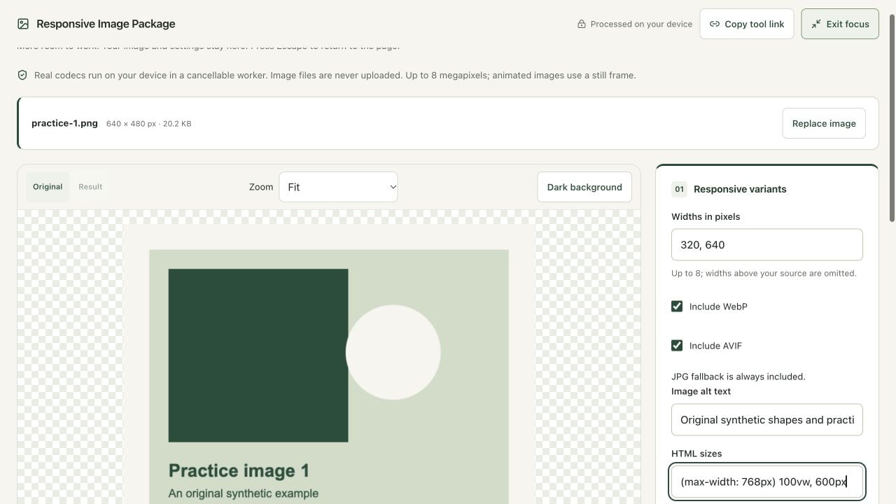
Write Image alt text that communicates the image purpose. A meaningful product photograph may need its product description; a decorative graphic often needs an empty alt value. The tool escapes attribute characters but cannot determine the correct accessible description. HTML sizes describes the CSS space the image will occupy, not the intrinsic file width. The default (max-width: 768px) 100vw, 1200px is only a starting example and needs correction for your layout.
For a full-width mobile image and a 600-pixel desktop content column, a suitable starting value may be (max-width: 768px) 100vw, 600px. Account for real padding and column widths. The srcset width descriptors reflect the generated files, so a 320-pixel variant is labeled 320w. The picture element lists AVIF, then WebP, with a JPG img fallback. The fallback width and height reserve the correct aspect ratio; they do not force the element to occupy those exact CSS dimensions.
4. Create the package and verify before publishing
Choose Create responsive package. Processing runs sequentially and can be cancelled. The result table lists every generated format, width, height and measured byte size, alongside the comparison with the original. A resized or encoded output may still be larger than an efficiently compressed source. The comparison reports that result plainly. Transparent pixels are filled with your JPG transparency fill color for the fallback, so check the fallback against the page background.
Download ZIP includes variant files, picture.html, manifest.json and README.txt. Unzip into a test folder and place the images beside the HTML snippet or update every file path for your deployment. The general-purpose snippet includes loading="lazy". Remove that attribute for the main above-the-fold hero and assess fetchpriority="high" in your page. Test desktop, mobile and higher-density screens in the real layout before publishing. This article and the current implementation are prepared locally; creating a ZIP does not deploy anything.
Sizes, screen density and the fallback
A browser combines the source candidates, the declared layout size and device pixel density when selecting an image. Supplying only one enormous file can waste transfer bytes; supplying only a small file can make a large or high-density display look soft. A correctly sized collection gives the browser a useful choice. Its decision is not a promise that the smallest file will always be used, and browser caching can affect repeated observations.
Responsive markup does not replace compression or good layout. Avoid shifts by reserving an aspect ratio. Keep the main content image discoverable in HTML and do not delay its loading unnecessarily. Confirm the HTML paths after moving the files: an intact ZIP on your computer says nothing about whether the published browser can load every source. Inspect the JPG fallback too, especially if transparency is important. That fallback supports older clients but deliberately contains an opaque background.
Verify your result
- Confirm 320 × 240 and 640 × 480 variants for the 640 × 480 example, with all selected formats present.
- Open picture.html and compare filenames and width descriptors against manifest.json. Adjust sizes and alt text for the real page.
- Inspect individual downloaded files at 100%, then test the actual page on mobile and desktop.
When the result needs work
- No usable widths: request a width no larger than the source. The tool blocks enlargement.
- A hero loads late: remove general-purpose lazy loading for that important image and measure the actual page.
- Modern sources fail to load: check relative file paths and ensure the server supplies appropriate image content types.
- Transparent artwork gains a rectangle: the JPG fallback uses the chosen fill. Select a fill matching the destination or design a different fallback strategy.
References and next steps
Open responsive images to reproduce the workflow. Technical references reviewed October 9, 2026:
- MDN: picture sources and fallback
- MDN: srcset, sizes and image loading
- web.dev: optimize Largest Contentful Paint
For another task, use Lossless Compress, Image Info or Image Compare. Files remain on your device; optional usage analytics never include image contents or filenames. Read our privacy policy and editorial policy. If an instruction differs from your result, send the page URL and a description so the guide can be reviewed.
Find the right tool for your image.
Explore the free workspaces, read their methods and inspect your result before sharing.
Explore image tools